
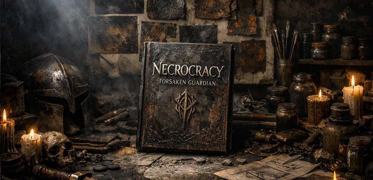
Visualizing the Covers and Atmosphere of Necrocracy
A book’s cover is the first line of defense against a polite, sanitized world. Before a reader ever opens the first page to taste copper on the tongue or feel the chest-tightening pressure of an ancient ritual, they look at the art.
When it came to visualizing Necrocracy: Forsaken Guardian, I knew standard fantasy aesthetics would not cut it. Sleek heroes bathed in golden sunlight or glowing magical swords have their place, but they belong in a different genre entirely. If the prose is going to drag you into a decaying world of ash and bone, the visual identity has to start choking you before you even crack the spine.
Here is a look behind the curtain at the creative process, mood boards, and aesthetic choices that built the grimdark atmosphere of Necrocracy.
Stripping Away the Gold
The primary goal of the visual design was weight and decay. Modern fantasy design often falls into the trap of over-polished digital sheen—everything looks clean, sharp, and weightless.
To break that mold, the mood boards for Necrocracy were built on textures rather than illustrations: cracked stone, oxidized iron, oxidized verdigris, and the dull, light-absorbing matte finish of ancient armor left too long in the damp. Colour palettes were ruthlessly restricted. Bright primaries were stripped away, leaving only bruised purples, sickly amber tones, charcoal greys, and the sickly white of unpolished bone.
Every design choice had to answer a single question: Does this look like it could crush a hand if you dropped it?
The Anatomy of the Cover
Designing the cover art required mirroring the psychological claustrophobia of the prose. To manifest this vision, I tasked my daughter—a concept artist—with translating the tone and palettes into a singular image. She isolated the Wyrdglass Dagger. A sentient artifact. The definitive centerpiece.
She drafted mockups to test their resonance. One raw sketch struck a nerve: the central blade, marked by its serrated mid‑spine and tapering tip. We refined the edges, weathering the relic until it looked excavated from an unknown epoch rather than forged in a smithy. The final coloured rendering shed its identity as a simple weapon. It stood as a central character, bearing the thematic weight of the entire narrative.
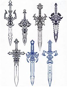
Constructing the composition required digital excavation. We built layers in photo editing software. We stacked textures, discarded the failures, and manipulated the colours until they bled with the right atmospheric dread. Instead of dynamic, flying action poses, the composition relies on stillness and monumental weight. Shadows swallow the edges of the frame, forcing the eye inward toward the central textures of worn metal and weathered stone. There are no friendly beacons of hope here. The atmosphere communicates isolation, grit, and the cold reality of a world built on the ruins of history.
Typography played an equally critical role. Clean, modern sans-serif fonts were off the table. We crafted our own custom font, building the design one letter at a time. The title needed to look carved into a tombstone or stamped into heavy plate iron—sturdy, weathered, and permanent.
Visualizing the Atmosphere
Atmosphere in dark fantasy isn’t just about painting a dark room; it’s about establishing a sensory contract with the reader. The visual identity of Necrocracy serves as a visual promise: Here, power leaves a stain, history is a physical weight, and nothing is clean.
When you look at the cover or the accompanying visual assets, you shouldn’t just see a picture of a book. You should feel the drop in temperature, catch the faint ghost of ozone in your nostrils, and know precisely what kind of dark you are walking into.
Joe Sarkic writes award‑winning grimdark fantasy and science fiction, crafting atmospheric tales of haunted realms, fractured megacities, and the people who survive them. Step into Veil of Dawn’s Promise and Necrocracy: Forsaken Guardian to explore worlds where both sorcery and technology demand a price.
Join My World